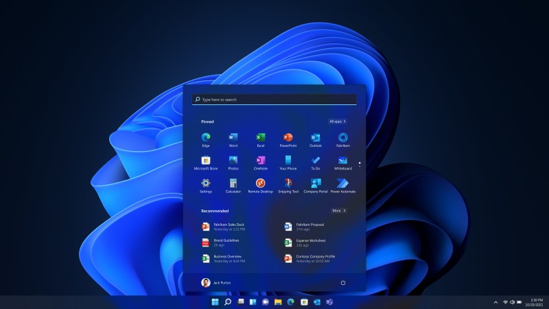
Mobile-Focused Windows 11 Leaves Taskbar Stuck Along the Bottom

Yeah, I’ll admit it: I’m a Windows person. Two years ago this summer, I traded in an overworked Windows 7 laptop that was literally screaming in pain for a SFF Windows 10 box as my main machine. But 10 might mean the end for this scribe, who has used Windows since the late 1980s. Admittedly, it’s for a fairly petty reason — Microsoft have gotten rid of alternate-location taskbar support in Windows 11. As in, you can have the taskbar anywhere you want, as long as it’s the bottom of the screen.
Years ago, I switched my taskbar to the top for various reasons. For one, it just made more sense to me to have everything at the top, and nothing at the bottom to interrupt visual flow while reading a web page or a document. Plenty of people move it to one of the sides or hide it when not in use for the same reason. More importantly, I thought moving the taskbar to the top would help with my neck/shoulder strain issues, and I believe that it has. So oddly enough, this one little thing may be the dealbreaker that gets me to switch after thirty-something years to Linux, where top-aligned taskbars are more or less the norm.
I’m not alone in my fierce defense of a relocatable taskbar — a post about the issue on the Microsoft Feedback Hub has received over 17,000 votes of support, as it is one of the most requested features. However, in a recent Reddit AMA where a user asked about moving the taskbar to the sides, Microsoft basically said that the UI reflow is difficult to implement there and is not worth it, so they removed the feature. What? Yeah, you read that right. That ‘really small’ set of users who took the time to take to the feedback hub? Screw them, I guess, and legions more who took to other Internet outlets to complain and commiserate.
(And) when you look at the data, while we know there is a set of people that love it that way and, like, really appreciate it, we also recognize that this set of users is really small compared to the set of other folks that are asking for other features. So at the moment we are continuing to focus on things that I hear more pain around.
— Tali Roth, Microsoft’s Head of Product, via Neowin
What I don’t get is this: if they’ve already implemented it on the previous versions, what’s so hard about doing it again? Did they completely rewrite the codebase for Windows 11 or something and didn’t want to do that part this time?
It seems as though the problem is that way back when, they implemented the standard case of the taskbar being at the bottom, and treated the top and side locations as exceptions and coded them thusly. That’s obvious enough.
So probably they’re tired of that work-around now, and, whether they rewrote the codebase for Windows 11 or not, they probably recognize that the whole taskbar object ought to be built from the ground up in such a way that it supports any of the four locations, and just don’t want to bother in favor of implementing or tweaking other features.
Of course, this is all wild speculation. I’m not even sure this box of mine will run Windows 11. So feel free to pick up where I’ve left off in the comments. And I guess I’ll take your Linux distro recommendations as well, because I figure some of you will do it anyway. I’m thinking KDE Neon or something.
On the other hand, there are a few upsides to Windows 11: it has an OS-wide dark mode, and they brought back the idea of the startup sound. Remember reassigning the startup sound to some mp3 you got off of Napster ripped from a CD? Those were the days.
Images via Microsoft
Post a Comment