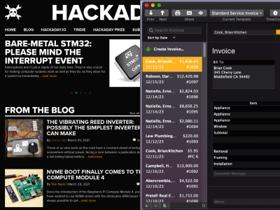
Hackaday Forced Into Light Mode

Hackaday has always been dark mode. Gray10 is less jarring when you’re burning the midnight oil on a project, so we give you a lot of it. Fifteen years ago, it was called “reverse video” or “trog mode“, and we were the freaks. We were doing it wrong. We had the colors “backwards”. Dark mode used to be edgy, outré, but dare we say it, a bit sexy.

They even ripped our highlight yellow!
Flash forward, and everyone has come over to the dark side. Facebook has a dark mode. Google has dark mode. Across the Microsoft empire, from Windows 10 to GitHub, you can live your life in the dark. Heck, even the White House has a dark mode! (They call it high-contrast mode, but they’re not fooling anyone.)
Dark mode here, dark mode there. It’s mainstream. Dark mode has become corporate cool which is nobody’s idea of cool.
We’re not saying that all of the aforementioned institutions are biting the Hackaday style, but, well, they’re all biting our style. Where were they when we were the only website on the whole darn Internet with a sensible background color? Huh? Dark-mode-come-latelys!
But Hackaday doesn’t rest on its laurels. We have our fingers on the pulse on the modern hacker. Where previously you would be up late at night researching Hackaday for juicy nuggets of communal wisdom to help out with your current hack, you’re probably “telecommuting” these days — a euphemism for working on your private projects even while the fiery ball is still in the sky. (Wink, wink, nudge, nudge.) It’s only natural that you’d want a lighter background color to match your new lifestyle. We hear you!
So we present you, Hackaday Light Mode . Enjoy!
[Editor’s note: For historical accuracy, we had phosphor green headings in the very beginning, in place of the jarring white. If you want to relive those glory days of yore, or just to go back to Hackaday in dark mode, there’s always CSS scripting.]
Post a Comment